- EnChromas and screens
Do EnChromas work on screens? There have been conflicting reports on this, even from EnChroma themselves, where I have seen them claim they would and would not work. Of course, it may well depend on the type of lens in questions, but I always thought it an interesting question. I found a paper today that confirmed my intuition.
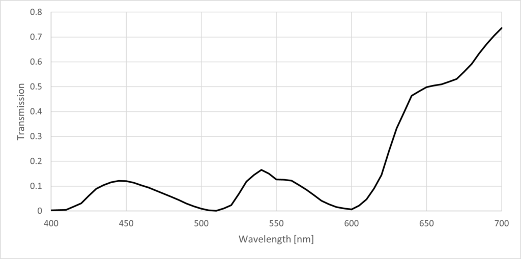
Their graphics were very useful but awful from a design perspective, so I’ve digitized and regraphed them. The study used EnChroma outdoor (Cx3) lenses, that have a transmission that is shown below with notches (absorption) maximally at 600 and 510 nm.
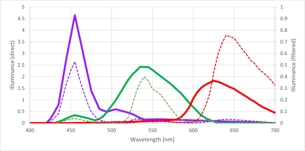
An Acer IPS 34″ display was used in the study. The spectra of each of the 3 primaries was measured and are shown in the solid lines below. The screen is not considered to have a very large color gamut. Recall that the color gamut of a screen is mostly proportional to how narrowband the primaries’ emission spectra are. The broader they are (the more they overlap) the smaller the gamut will be and the less saturated colors can be displayable. The largest gamut would be generated by primaries that are monochromatic, such as a laser projector with primaries at exactly 450, 540 and 650 nm. In that case, the corners of the triangular gamut would all rest on the spectral locus of the chromaticity diagram (and be maximally large).
So how can we improve this Acer screen? Well, we’d definitely want to start by narrowing those emission spectra, and push the vertices of the color gamut closer to the spectral locus, thereby increasing the gamut size. Enter EnChroma glasses. Viewing the screen with EnChromas on is the same thing as putting a film of EnChroma material over the screen, and in that case, the effective, filtered primary emission spectra are equal to the product of the direct spectra and the lens transmission. These filtered primaries are represented by the dashed lines below.
First, notice how the peaks, most notably the green peak of the M-cone, have become much thinner. The red has also become effectively thinner, when you consider that all of the high wavelength emissions get truncated by your eye just not being sensitive to them. The blue (represented by purple because I’m colorblind) doesn’t appear that much thinner. Therefore, we expect to see the red and green vertex to move towards the spectral locus and increase the size of the gamut.
Second, notice that the area under each curve is approximately equal for the direct spectra, but once filtered, the red emissions dominate. This is also clear by looking at the transmission spectrum. It simply means that the EnChroma lenses are red-tinted, at least here. I have usually seen references to the tint as being magenta, but its a bit hard to know which lens version each viral influencer or Reddit skeptic has got their hands on.
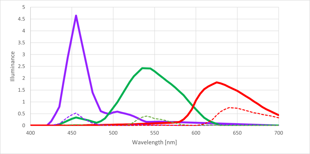
Third, notice that I have the direct and filtered spectra on different y-axis to make the comparison easier. In fact, when we place them on the same y-axis, as below, the emission of each sub-pixel (R, G, B) is much weaker. This is pretty obvious, since the outdoor EnChroma lenses are SUNGLASSES after all, and the transmission spectra shows the transmission to only be about 10% on average, meaning 90% of the light is absorbed or reflected.
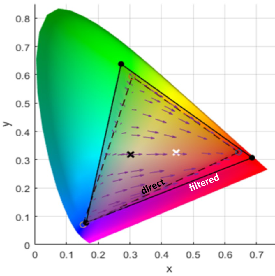
The graph below is what we get when we plot the display’s direct (unfiltered) and filtered gamuts on the chromaticity diagram. The direct gamut is given by the dashed line. The filtered gamut is given by the solid line, and is clearly a little bit larger. The vertices represented by the green and red primaries have moved closer to the spectral locus (the edge of the colored area) and the red has moved to longer wavelengths (towards the right corner), as we expected.
The black x marks the neutral (white) point of the direct gamut, and the white x marks the neutral point of the filtered gamut, which is shifted far towards the red side, indicating the red tint. The arrows within the gamut also show how each color is shifted as a result of the filtering, with pretty much everything being turned redder, with the slight exception of the greenest/cyanest colors that already lack red, so are turned ever so slightly more saturated green/cyan.
This red tint shouldn’t necessarily be a problem though, since your chromatic adaptation should be able to compensate for it after wearing the glasses for a while, slowly shifting the neutral point back to where it was and “subtracting” the red “cast” from your vision. At least that’s the idea.
So is that it? EnChromas increase your gamut when looking at a screen? Not so fast…
First, the paper also applied the EnChromas to a Google Pixel 6, which has an AMOLED “wide gamut” display that already has primaries with narrower emission spectra. Viewing the Pixel display through the EnChromas didn’t actually increase the already large Gamut at all, so it seems the trick only “works” for displays that can only maximally display sRGB (a standard gamut size) or worse.
Pilestones
The paper also put Pilestone glasses over both displays in the same way and showed that while they slightly increased the purple end of the gamut, they severely truncated the green side of the gamut.
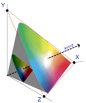
Second, the 2D chromaticity diagram represents chromaticities… duh… which is all colors of the same luminance. If you imagine all of the colors a trichromat can see, at different luminances, we get a 3D color solid, represented below by the gray shape. The brightness/luminance of the colors increases along the vector X+Y+Z, and each value along this vector is associated with a slice of the color solid normal to the vector, each of which is essentially its own chromaticity diagram. However, notice as you get to smaller luminances how the chromaticity slice shrinks, indicating that there are fewer distinct colors that can be distinguished in the entire visual gamut. We all know this intuitively: any color task gets harder when the lights go dim.
On the same chromaticity diagram, above, it seems clear that the filtered gamut is larger, but we also have to remember that we are wearing sunglasses inside. The screen is much darker and therefore the corresponding chromaticity diagram is smaller. You therefore get a bigger slice of a smaller pie, and the number of total number of unique colors you can differentiate with the sunglasses on still goes down.
Just like with chromatic adaptation, your visual system is actually pretty good at compensating for the change in brightness, such as by dilating the pupil. However, this compensation only works to a degree. If you wear your sunglasses outside, where there is already more than enough light, a loss of 90% of the light still leaves more than enough for your eye and there is probably not going to be any change to the size of your visual gamut. Past a certain luminance, you kind of “max out” the size of your visual gamut (and it can even start to decrease again if things are too bright!). However, if you are looking at a display at 10% brightness, that dimming is more than your eyes can compensate and the visual gamut is certainly smaller.
So what about the indoor EnChromas? These don’t filter out nearly as much of the light and are often recommended for screen-work, so why didn’t the paper go with testing indoor glasses? Well, as the filtering of light is the working principle of these notch-filter glasses, a lighter filter just means a weaker color effect. The indoor glasses would have almost no effect on “shaping” the primaries’ emission spectra and while the visual gamut would not shrink much, the effective display gamut would not increase much either.
Want to boost the colors you can see on your display? Buy a “wide gamut” display and/or boost the saturation past sRGB in your settings. It will do way more than EnChroma lenses ever could.
- Fraud, beheadings and bibliographies
I read a fascinatingly anachronistic colorblindness article yesterday that was written in 1956, but reads much more like it was written by a millennial; in fact, it had an uncanny resemblance to the time(s) that CGP Grey lost his mind on tracking down the origin or earliest mention of the name Tiffany.
If YouTube would have existed in 1956, Gordon Walls certainly would have likewise vlogged his experience, but instead, he published it to a journal, where his wacky tangents on beheadings and lamp-fraud and may have gone unappreciated. Instead of the provenance of “Tiffany“, Walls was rather intrigued why the first ever allusion of colorblindness anywhere in European historical literature was [at the time] less than 200 years old, considering that, just as it is now, colorblindness effected 1 in 12 men. He spent many years of his life trying to track down earlier mentions, reading literally every source listed in Helmholtz’s exhaustive 6000+ resource long 1860 bibliography on color vision, the very last of which was quite elusive.
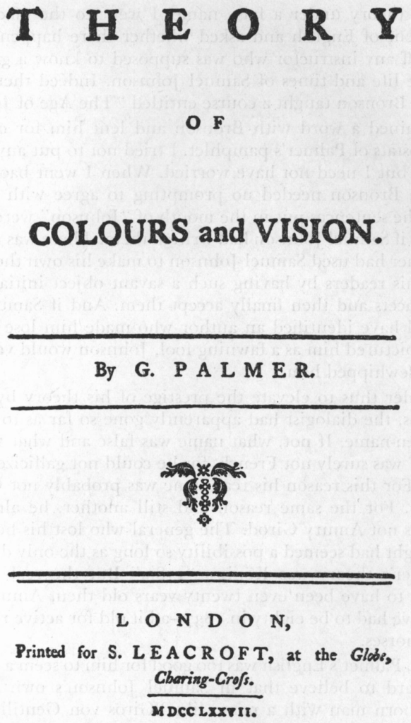
This last resource happened to be G. Palmer’s pamphlet “Theory on Colors and Vision“, published only months before the famous “Harris the Shoemaker” case study became widely circulated as the first recorded description of color blindness (both in 1777). Palmer’s article promised to reveal an older case of colorblindness, but by the time he tracked down the last surviving copy, which just happened to be in Benjamin Franklin’s personal library, he found something much more interesting.
Actually, it was me reading several old, translated color vision papers from MacAdam’s 1970 collection “Sources of Color Science” that introduced me to Palmer, whom I had never heard of, but just like Walls, I was shocked to see that Palmer had included in his 1777 pamphlet a theory of trichromatic vision that mirrored and predated Young’s (later credited as the Young-Helmholtz theory) by a quarter century. It was my search to find why this fact was not more widely known (in color vision circles) that led me to Walls’ article. Hell, I had to add it to Wikipedia myself!
For the rest of the story, read the open source article here. Its a page turner. If you want to read the original Palmer pamphlet, it is not online, maybe I should scan it…
- Wiki on Color Blind Glasses
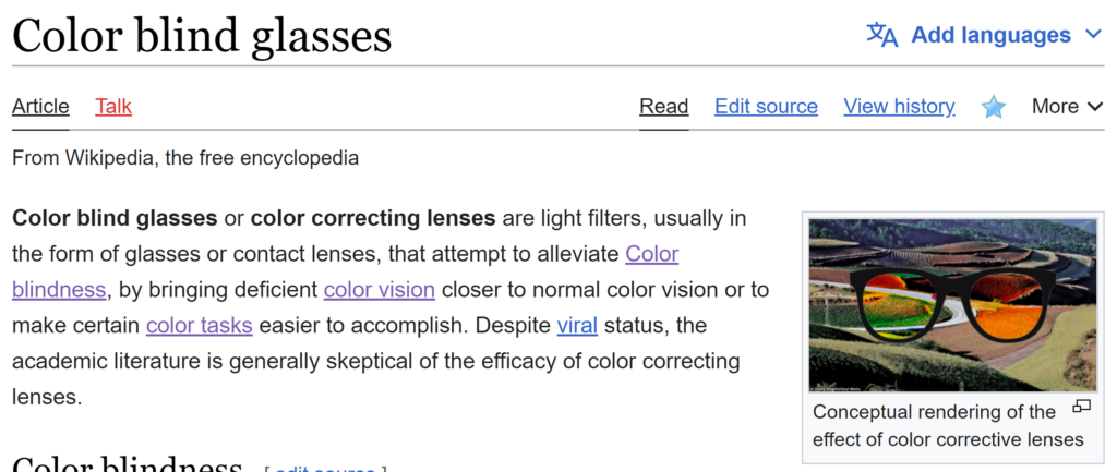
In addition to starting my MSc last month, I’ve also been spending some time cleaning up the terrible state of color vision articles on Wikipedia. Today I published a new article, which until now was just a few lines on the colorblindness article and in the EnChroma article. Color blind glasses (color correcting glasses) now have their own article with quite a bit of information on each kind (EnChroma, Vino, ColorMax, X-chrom, etc.). I am used to being pretty fast and loose with my sources in the videos, so writing on wikipedia has really required me to be more specific about the provenance of information. I started using Zotero to track my sources and this has been a big help in planning my videos too.
- First human cured of colorblindness!?
A paper was published at the end of August in the journal BRAIN that shows possibly that the first case of colorblindness has been cured. This comes after 13 years of apparent stagnation in gene therapy for CVD, ever since the Neitz Lab cured dichromacy in 2 squirrel monkeys in 2009.

The study involves 4 achromatic teenagers, 2 of each of the 2 main forms of achromatopsia, affecting either the CNGA3/CNGB3 proteins, which form part of the phototransduction pathway required for the cone photoreceptors to send signals to the brain.
The 4 subjects received gene therapy via a subretinal injection and after several months, fMRI in 2 of the subjects showed that the brain patterns excited by watching a spinning disk were very similar whether the scotopic (rod-driven) system or the photopic (cone-driven) system was active (depending on brightness). This indicated that the cones were now functional, which should at least alleviate some of the worst symptoms for achromats: photophobia and poor visual acuity.
Whether the subjects were able to interpret color was interestingly, out of the scope of the article. However, its also expected that the development of color vision would take several months and possibly be mild. Regardless, one older subject did claim that he had an easier time interpreting traffic lights. I’ll be making a video on these results soon.
- My least favourite traffic sign
Another short up this week. There is a traffic sign that means “give way to oncoming traffic” often seen on single-lane bridges that in europe looks similar to the sign pictured below.
Since protans perceive red as darker, in many conditions, this sign can appear all black and therefore potentially be confused with a sign meaning “two-way traffic”, which would encourage the driver to continue into oncoming traffic instead of yielding.

European Traffic Sign: “Give Way to Oncoming Traffic” 
“Two-way Traffic” Many viewers commented that the two-way traffic is actually supposed to be triangular, and the circular sign isn’t allowed under the Vienna Convention, which is true, despite existing on the internet.
That said, I don’t think it completely dilutes the point, as the signs should be differentiable on multiple characteristics (not just the sign shape), and I think the choices of triangle vs. circle are often arbitrary at best. I would argue that the “give way to oncoming traffic” should – if anything – be the same arrows in an upside down triangle to be more in line with other priority-related signs instead of prohibitory signs, which it is absolutely not. Likewise, the two-way traffic should be in the circle and not the triangle, since it doesn’t involve yielding to anyone.
- New FAQ and Tools pages
Last week, I put together some new content for the website. I was introduced to Adobe’s new color accessibility tools and needed to highlight them somewhere, because they are an absolutely brilliant tool for facilitating colorblind-accessible design. So I made a Tools page, where I outline that and 3 other tools that I use all the time.
Also, I put together an FAQ page. This whole project was kind of envisioned as a giant FAQ. People kept posting the same questions and misconceptions about colorblindness on reddit, and instead of answering them every time, I thought just linking to a video would be more effective. I can’t make videos about everything – or rather… fast enough – so I’ll just cover everything in there and link to videos as available/applicable.

- My favorite way to explain colorblindness
Last week I made a short for YouTube that I have been thinking about for awhile. The absolute quickest way to describe what is happening to colors for the colorblind… is just to squish a color wheel.
Here for the reddit post with some discussion.
- Indian Universities Open Up Slightly
The most common complaint among the color blind, is how many careers we are prohibited from having. In the west, it is common for the military, police and aviation to restrict entry to the red-green colorblind, but in the developing world, the prognosis for the colorblind is much bleaker. When I say the developing world though, I specifically mean India, who grabs the most headlines, mainly because of our shared language.
India has typically kept a stranglehold on their colorblind citizens by restricting even careers that the west would consider specifically accessible to the colorblind, such as engineering and accounting roles. Its no wonder that such a large part of Chromaphobe’s viewership is from India.
Luckily, it has been getting better for India’s colorblind. In 2020, The federal government removed restrictions against receiving driver’s licenses for the mild and moderately colorblind, and last month, colorblind Indians earned another victory when the supreme court ruled in favour of a student who had been denied admission to film school based on his colorblind.
In 2015, Ashutosh Kumar was accepted into a program for film editing at the prestigious Film and Television Institute of India (FTII), only to have his admission revoked when they discovered he was colorblind during a routine medical exam. Their grand reasoning, as revealed during the ensuing 6-year legal battle, was that his admission was not “technically feasible”.

Film and Television Institute of India It turns out, “not technically feasible” refers to the color-grading module of the degree, which would indeed be a problem for Kumar, but when that module comprises one 20-minute module of a 3 year degree, its basically irrelevant.
To me, this would be akin to saying that I should not have been allowed to complete highschool in Canada because my Protanopia rendered me useless at the 1 or 2 days of titration labs in my chemistry class. To ban someone who would be unable to complete what probably amounts to less than 1% of the degree’s total scope is simply… vindictive.
If a colorblind student wants to enroll in a program to be a colourist, than I can support such a ban. However, as a film editor myself – and not only for the Chromaphobe YouTube channel – colorblindness is hardly ever a factor, and definitely not one that can’t be easily overcome.
Case in point: Christopher Nolan is colorblind and it has not prevented him from entering the upper echelons of filmmaking. While he is known mainly as a writer/director, he also has five editing credits from early in his career. Not to say that his colorblindness had zero effect on his career. After all, most of the editing credits were on black and white film stock… but filmmaking is an artform where our differences should be celebrated.

Christopher Nolan: a wildly successful colorblind filmmaker This was actually reflected in the supreme court’s decision when they forced the FTII to admit Kumar, stating that “filmmaking and editing is a form of art… the institute must adopt an inclusive and progressive approach“. Kumar will begin his studies in 2023: 7 years late…
The supreme court has mandated this ruling apply to all film schools in India, but it doesn’t look like there will be much help for the prospective colorblind engineers currently barred from receiving engineering degrees, since engineering can not so readily be described as a form of art. That said, India’s Right to Persons with Disabilities Act of 2016 is still young, and could be making some more changes in the future. I hope India’s colorblind continue to win back their rights.
- Dutch Bike Lanes
I made my second youtube short earlier this month about a disappointing run-in with bike lanes in Holland.
https://youtube.com/shorts/zfNlIbD24d0
Second part of the series on the evolution of color vision will come out later this weekend.
- Escape Rooms
Just had a call with the owner of an escape room. I chatted with the game master after a game, which saw my wife and I go head-to-head in an arcade style battle. The theme was highly colorful and being alone in the room without my wife to rely on posed several issues.
SNAKE
First, there was a game of Snake that you play on the ceiling. Once my snake reached 3-4 pixels in length, the game would restart. I assumed the game was glitched until I started talking to my wife across the wall. Nope! It turns out there were ‘hidden’ green blocks on the yellow background that I kept running into and dying. Hidden to me at least. Without knowing where they were, I could just hope to avoid them, but eventually just put down the joystick and waited for my wife to trigger the next stage.
My Solution? Change the colors. The hardware for this game relies on RGB LEDs, which means the code just needs one number to change to make that green darker, and therefore differentiable from the yellow background.
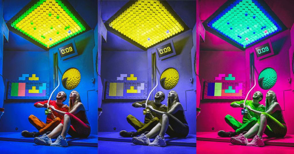
In this ‘escape room’, players go head to head playing retro arcade games, like this snake game on the ceiling.
Left: the original – red-green colorblind people do not see the green blocks on the yellow background
Middle: simulated protanopia – color normals can see what a I see
Right: Hue-shifted – the colorblind can now see where the green blocks are.TRIFORCE
Second, there was a triangle of colored LEDs that you need to use some buttons to rotate and slowly arrange into a triforce pattern. This pattern must match a picture on a screen elsewhere in the room. The first problem, is that the colors (blue and purple) looked very similar and were barely differentiable, but I managed. However, knowing which corner each color was supposed to go in was a wild guess, since the colors on the puzzle and the color on the solution reference in the other part of the room were not directly comparable.
My Solution? Again… change the colors. Getting four colors that are not only easily differentiable, but also can be compared to a solution with slightly different colors is quite easy to satisfy all dichromats: purple. red, yellow, white. I also recommended changing the logic of the puzzle so that it doesn’t matter which colors are grouped in which corner, as long as they ARE arranged in that ‘triforce’ pattern. I imagine a color-normal person would never ‘chance’ into an alternative solution and it should only matter to not frustrate a colorblind player when they think they’ve found the solution, but got the colors from the reference mixed up.
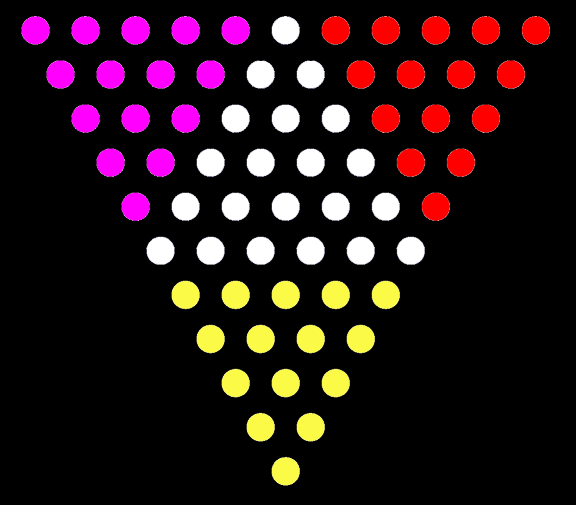
Triforce puzzle, with my recommended colors LASER
Finally, there were two puzzles with lasers. The first required a Katherine Zeta-Jones style maneuvering around the lasers (I imagine I was just as sexy). The second was a classic ‘arrange the mirrors to get the laser to hit the target’ puzzle. I had no issues with these… because I specifically chose the blue-room instead of the red room. Blue lasers are super visible to me, but red lasers are often invisible, as they are to most protans. Had I been in the red room, that would have been two more unsolvable puzzles for me.
My Solution? Well, without ruining the red vs. blue theme so carefully conserved by the owner, just ensuring that colorblind people go in the blue room is all that is necessary here. Just a little extra training for the game masters, or something to add to the disclaimer.

Katherine Zeta-Jones maneuvering around lasers in Entrapment (1999) HIS SOLUTION
Funnily enough, the owner tells me that they have a colorblind game master that also had trouble with all of these things. Whoops.
Changing even one number in code can be expensive when you outsourced the development (this I know), which is why things like colors should be stored in a parameter file that can be easily changed by the end user. The compromise for the owner was to put a message on the booking website that colorblind people should be in at least a group of 3 so they aren’t alone in a room, and they will look into having some cheap ‘colorblind glasses’ on hand. This is actually a pretty good application for some cheap magenta lenses, since there is no Denotative Color Task involved in the rooms. While I usually refer to these lenses as a blunt instrument, a filter that can just tweak the yellow and green in the Snake game to look slightly different without caring that everything may look ‘unnatural’, is a great solution in this over-saturated escape room.
Out of 50-60 escape rooms I have done with my wife, maybe about half have had puzzles that are at least very difficult for me, if not impossible, and the vast majority of those could have easily been designed to be colorblind friendly without sacrificing the theme. Have you ever had trouble in an escape room because of your colorblindness? Tell me about it in the comments.