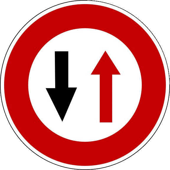
Another short up this week. There is a traffic sign that means “give way to oncoming traffic” often seen on single-lane bridges that in europe looks similar to the sign pictured below.
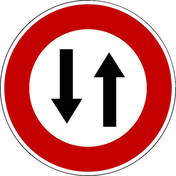
Since protans perceive red as darker, in many conditions, this sign can appear all black and therefore potentially be confused with a sign meaning “two-way traffic”, which would encourage the driver to continue into oncoming traffic instead of yielding.


Many viewers commented that the two-way traffic is actually supposed to be triangular, and the circular sign isn’t allowed under the Vienna Convention, which is true, despite existing on the internet.
That said, I don’t think it completely dilutes the point, as the signs should be differentiable on multiple characteristics (not just the sign shape), and I think the choices of triangle vs. circle are often arbitrary at best. I would argue that the “give way to oncoming traffic” should – if anything – be the same arrows in an upside down triangle to be more in line with other priority-related signs instead of prohibitory signs, which it is absolutely not. Likewise, the two-way traffic should be in the circle and not the triangle, since it doesn’t involve yielding to anyone.
Leave a Reply