Transcript
What happens when color-normals try to develop systems to help color blind people?
Today on chromaphobe, I’ll be ranting about the ColorADD system, a true failure of design for accessibility.
WHAT IT IS
The ColorADD system uses symbols to represent colors, specifically to aid the color deficient in identifying colors. It was created in 2009 by Miguel Neiva in Portugal, a designer and marketer and importantly for later in the video, not colorblind.
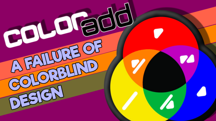
The system does not just assign shapes and symbols to colors arbitrarily. It also assimilates the main aspects of color theory into its foundation by using three primary symbols to correspond to the three primary colors of red, blue and yellow, or atleast the primary colors you learned in kindergarten.
Secondary colors are represented by a combination of the primary symbols, so a combination of the red and yellow symbols would represent orange, for example. Black and white can exist on their own, or be combined with any primary or secondary color to represent light or dark shades thereof.
Despite not reinventing the colorwheel, as some media coverage claimed, ColorADD has very slowly gained momentum in the past decade thanks to the ambition of its creator, but has not enjoyed much success outside of Portugal, Spain and Brazil.
WHY IT’S IMPORTANT
The ColorADD system was developed specifically for the colorblind, so for those of you just joining this channel, let me explain why.
Colorblindness arises when someone is unable to differentiate two colors that would normally appear very different to a color-normal. Blue and purple, yellow and green or red and brown are all common colors of confusion, that – depending somewhat on the shade – I will see as the same color. This is exhibited in two ways:
- We have trouble spotting an object of color A on a background of color B if colors A and B are a confusion pair for our type of colorblindness (or close to it).
- We have trouble interpreting a color using color language that was developed by color normals, i.e. we simply have trouble naming a color correctly.
The ColorADD system is supposed to help with the second point, by supplementing ANY use of colors with a symbol of that color, so that when we are uncertain of the color of a shirt, a crayon, or maculine lipstick, then we can refer to the symbol that is on the object.
COLOR FOR COLOR
So clearly, ColorADD sounds like a useful tool when colorblind people are using art supplies like paints or crayons to create anything that needs to seem realistic, or for style, such as buying clothes or throw pillows, where the color may need to match other colors or have some kind of emotional meaning.
It COULD be a useful tool, but most of the time, there are simply better options:
- Alternative 1: Just use the names of the color. If its red underwear, print “red” on the tag. If it’s brown paint, print brown on the tube.
If you are in a single-language market like the US, this solves all the problems. If you are in a mixed-language market like the EU, it can be more difficult, but – and I suspect I will get some pushback for saying so – I find it unlikely that ColorADD would ever be more useful to a colorblind person than them just learning the color names in the regional lingua franca, which in the EU… is English. - Alternative 2 solves this problem by using the true universal language: numbers. I know numbers are much less sexy than symbology, but anyone who has done any digital design should know their way around the color wheel and 3D color spaces like RGB or HSV. If I see a shirt that says [HSV] = [330, 100, 100] on the tag or even just HUE=330°, I know that means hot pink.
Compared to the 25 or so colors that can be represented by ColorADD, which excludes common colors like hot pink, beige or turquoise, using numbers can actually communicate a lot MORE information and be a lot more exact than using symbols or even language for that matter.
And just like ColorADD, there is practically no memorization required, as long as you remember that the true primary colors red, green and blue correspond to 0, 120 and 240 degrees. The problem of course, is that not everyone is good at mental math and may not instinctively think that 330° is 1 part 300° (magenta) and 1 part 360° (red), and therefore makes hot pink. - Which brings me to the third alternative: Follow your heart. When it comes to style, fashion or art, you don’t have to be a slave to other peoples’ color perception. If the colors look good to you, that is not an invalid or false way of seeing it. Unless it’s your career, you don’t have to appease color-normal ideals of what “looks right”.
If you care that your outfit’s color palette “works” for a trichromat more than if that outfit “works” for your own color vision, that’s a little effed up. Personally, I stopped caring about whether I was wearing blue or purple when I turned 25, and it was liberating to be able to wear shirts like this.
So in lieu of one of these three alternatives: either not caring about color or using language or numeric values to identify color, then yes, ColorADD could be a useful tool. But that is only in situations where the color itself is the important message.
COLOR CODES
Where it is absolutely NEVER a good tool though, is for color codes, situations where a colorblind person would need to interpret color, but the color is only used as intermediate information: to be translated into some other kind of info.
You can think of how graphs use a color code to refer to a legend, Tae Kwan Do uses a color code to indicate skill level, or how bombs use color to indicate the function of each wire. In all of these cases though, the color itself is arbitrary. I could mix up all the colors, and as long as we update the code or legend, the color code is just as functional.
ColorADD is used to supplement a lot of color codes, but unlike its sensible role in art and style, ColorADD should never be used with color codes. Despite this, most of the applications of ColorADD are for… color codes. I’m going to go through a bunch of these actual applications of ColorADD and tell you what alternative would be better as aids to colorblind users.
BAD APPLICATIONS
- GARBAGE CANS – Why is there color at all? This just forces people to memorize what waste corresponds to yellow. Banana peels? An elegant language-free solution here is to use openings on the containers that are the shape of the thing that goes there, such as a small round hole for beverage containers. Or, you know, just use an icon of the waste that belongs there… even if colorblindness didn’t exist, this would be a way better solution. A lot of color codes can simply be avoided by just using meaningful iconography, but some people just love to use color codes unnecessarily.
- APPLES – does the color help people pick an apple variety? Why not just put the name of the type of apple there, which is language-agnostic. What’s next, genetically engineering bananas so the color code changes as they ripen? Ridiculous.
- TRANSIT MAPS – These always rely heavily on color and rightfully so, color very much facilitates interpretation of the map, even for me. You may need to compare the line color to a legend or track a colored line along its route. Redundancy to the color is crucial. However, because the colors are arbitrary, the symbols can also be arbitrary. Even better, just print the number or letter corresponding to the route directly on the map because colorblind people don’t actually need to know the color, just the information behind the color. The color mixing aspect of ColorADD is absolutely not relevant here.
- NOTEBOOKS – Is this a thing? Do people really color code their notebooks? I mean, that’s fine, I guess, but I just wrote the names of the subjects ON the notebook. Don’t think that a color code (with ColorADD) is my best option just because a color code is your favourite option in a given scenario…
- SPORTS TEAMS – Whether you are watching or playing a sport, using ColorADD to indicate the jersey color is a slow, inefficient way to follow a game. Look, sports leagues figured this out a long time ago to make EVERYONE happy. Let each game have a white away-jersey and colored home-jersey, and spectators will never have any color problems. Sure, some leagues haven’t quite caught on yet, but you don’t get people to adopt a system that works by introducing a system that doesn’t work.
- PARKING SECTIONS – This IKEA parking lot in Porto had sections divided into colors so shoppers can remember where they parked, but each color was also indicated redundantly by a letter. A was always red, B was always blue, etc.… so why the ColorADD symbol? I am never going to remember my section by the color – with or without ColorADD – when I can just use the letter. Most people will have a much easier time remembering a number or letter, than remembering a color via remembering a symbol.
- BEACH FLAGS – Or really, any other measure of severity or status using the traffic light color convention, where green-yellow-red means go/caution/stop or good/okay/bad. Obviously, these are a terrible choice of colors when it comes to interpretation by colorblind people, but that is a whole different video.
The colours shouldn’t matter though… if we have meaningful iconography, which there is with checks, exclamations and exes, or happy, neutral and sad faces. Hell, you want to go for universality, just use emojis. Green… Yellow… Red…
Because the color mixing attribute of ColorADD does not add any value to the symbology, why use colorADD? - RUBIK’S CUBE – I don’t need to know what each color is. I just need to tell them apart. It’s actually easy to pick 6 colors that all dichromats can tell apart, if you include black and white. Otherwise, lots of colorblind speedcubers use symbols on their cubes so they can solve them easier. Here are a few examples of good implementations, but these speedcubers would never use the ColorADD system because of its fatal flaw.
FATAL FLAW
Maybe you’ve picked up on it already and its been bothering you for the past 5 minutes. But if I were to make this system over again, you can bet your ass that I would NOT use the same symbol for two of the primary colors. The shapes for red and blue… are the exact same, only differentiated by their orientation. So if you have an object that changes orientation, like a rubik’s cube… the two colors cannot be distinguished.
Sure, blue and red aren’t colors of confusion for 99% of the colorblind, but when you look at the secondary colors, the symbols for green and orange are also identical and ARE colors of confusion for most colorblind people.
Some applications have tried to patch this flaw by adding orientation lines, like are often added to alone-standing 6s and 9s to differentiate them, but the extra concentration required to parse the shape and orientation, then convert to a color, then convert that color to a meaning is… unnecessary.
Look, if I were to redesign arabic numerals, I would also definitely change the 6s and 9s to not be the same symbol reoriented. Likewise, if I were to redesign ColorADD, I would do the same, and it would probably look like… like uh… actually let me just see if a competing system already exists.
FEELIPA
So I could find ONE competing system called FEELIPA, coincidentally also conceived in Portugal in 2009.
FEELIPA works almost identically to ColorADD with the three primary colors and color mixing for secondary colors, plus light/dark colours, but the shapes make so much more sense. All the shapes are unique and not sensitive to their orientation. You COULD apply them to a color pencil and not have to think about which orientation was intended.
It’s a clearly better system in all but one metric…which is frustratingly important. ColorADD’s advantage is its distinctiveness. When you see any of their symbology on something, the rounded design makes it pretty clear that you are looking at a ColorADD symbol. However, if you see a nondescript circle on a blue object, you probably won’t immediately jump to think of the FEELIPA color-code. So maybe that’s why FEELIPA went silent in 2017, or maybe it’s because their sample applications were a little… useless, and clearly did not understand the struggles of the colorblind.
Now I’m pretty sure I could combine the advantages of both systems and make my own color-symbol system that worked… if I thought there were a useful market for one, which I think I made clear earlier… I don’t.
UNO
But if you want to see me get really mad about ColorADD, let’s talk about my least favourite implementation of it: UNO. This card game by Mattel is an incredibly common game, at least in North America.
When it is a player’s turn, they must play a card from their hand that matches the number or color of the previous card, so clearly, you need to tell the colors apart.
With *472* different variants of the game, Mattel is always looking for more ways to sell UNO, sometimes with questionable marketing decisions. For example, there is a:
- Babybel themed deck;
- A Kylie Jenner themed deck;
- A saved-by-the-bell deck that makes sense until I tell you it was published in 2020, 27 years after the show went off the air;
- A non-partisan deck where they have replaced the blue and red cards with other colors so as to not trigger political fights over the American dinner table.
UNO is second only to monopoly for the number of game variants that they’ve created, so when they see an opportunity for a variant – ColorADD Uno for the colorblind – they jump on it.
Now you could take a game of UNO and choose colors that are easily identifiable to even monochromats. You could even add patterns, symbols or shapes to the cards that are redundant to the colors, like they have done with so many variants already, like the Family Guy deck or the Muppet deck, or the baby animal deck…
but… they went with ColorADD. The version of ColorADD that needs orientation lines under all of the shapes because of that damn design flaw.
And the news went freaking crazy over it, with over 100 media clips hailing this as…
“The first card game to be…” https://www.dailymotion.com/video/x5zqqhj
Well, no, the first card games optimized for the colorblind are the ones that don’t use color, like bridge, cribbage, poker, you know, everything that uses a standard deck of playing cards that uses symbols instead of color, including… crazy eights… which is just UNO on a standard deck of cards.
So what does colorADD UNO solve? Even the shades of red, green, yellow and blue that the standard Uno uses are quite easy for protans, deutans and tritans assuming you’ve got a decent light on them. It wasn’t a problem that needed to be solved, and if it was they did a crappy job at it.
LEFTY UNO
Now allow me to digress a little, because this is a rant and rants aren’t supposed to have structure. Let me show you where an ‘accesible’ product can really fuck up. One of the other 472 variants of Uno is a left handed variant. When a rightie fans cards in their right hand, the top left corner of each card is shown, so that’s where they put the small number. But if you fan them in your left hand, the top right is shown and the number is covered. For left-handed versions of standard playing cards, the solution is simple, put a number in every corner… then they can be used by lefties or righties.
But Mattel had the bright idea to move the number to the top right corner, thereby removing them from the top left. So now lefties can fan the cards in their left hand, but righties would see nothing if they fanned the cards as normal.
This would be fine if a lefty could play Uno by themselves, but when you need multiple players to play it – who will all have different handedness unless you are in some left-handed cult – why would you not put numbers in BOTH CORNERS!? Especially considering that lefties that I consulted all fan their cards like a righty and never considered that the direction they fan their cards is a preference of handedness.
So now, the new lefty Uno deck not only screws over righties, but also makes most lefties adapt to a new way to hold cards.
The solution was obvious, put numbers in BOTH corners to let all lefties and righties play with each other, and let them choose which way they want to fan. Even better would be to make all 471 other variants of Uno also have numbers in all corners, which would make a lefty variant of Uno unnecessary! But hey, I understand that’s just one less opportunity to sell your game, I guess.
It’s just another example of someone failing at designing for accessibility, which is a big problem in board and card games that love to color code EVERYTHING, but again, that’s a different video.
…and don’t get me wrong, while I think UNO is a terrible application of colorADD, Neiva’s strategy to get ColorADD into an Uno game was a brilliant marketing move, based on the volume of news coverage alone.
And not only did it spread the word about ColorADD, but I also imagine it sold a lot of copies for Mattel, because there is nothing color-normal people like to do more than try to fix the colorblindness of their friends and family, which is why surprise Enchroma unboxing videos are so damn pervasive.
CONCLUSION
So look, I understand that if you want a system like ColorADD to go viral, you need to plaster it everywhere you can, including applications where it has no practical purpose.
I also don’t want to gatekeep and say that Miguel Neiva can’t try to help colorblind people just because he is not colorblind. It is quite common for minority communities, like the color deficient to balk at members of the majority color-normal community when they try to help us or understand more our experience. I do want color-normals to try to come up with ways to accommodate the colorblind, but I also want them to be well-informed of how colorblindness works so they aren’t doing more harm to the community than good by introducing bad systems and preventing good systems from taking hold. Is ColorADD “doing harm”? I’m neutral on that point but I wouldn’t be talking about this if I didn’t think it was something that could be improved.
This is Chromaphobe.
Leave a Reply