Footnotes
FOOTNOTE 1: CONE MOSAIC (5:07)
The small changes in luminosity curve are often due to differences in the cone mosaic. The retina is made up of the four photoreceptors (3 cones and 1 rod), but these proportions change from person to person. Some people have more red cones and some more green cones, and this affects the relative brightness of red and green.
FOOTNOTE 2: EDGE DETECTION (5:52)
Sometimes, LCD screens will literally display a third color at the interface between two colors if there is some weird aliasing somewhere in the system, and that can make the interface visible. Even without that, there is a lot of complex edge detection coming into play in both your retina and your brain, which is described in Rizzi 2014. It would have knocked this video 4 levels up in complexity though.
Transcript
INTRO
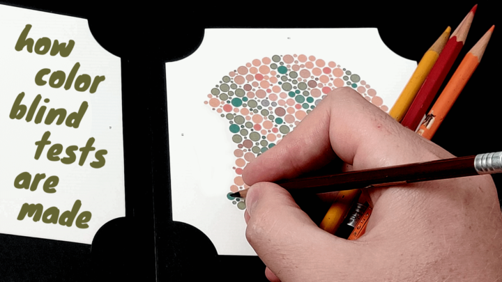
If you’ve ever taken a colorblind test, then it was probably something along this style. While I’ve heard them called colorblind inkblots, bubble tests or even fatalistically as death dots, the real name is an Ishihara Plate, the most common colorblind test in the world.
Today on Chromaphobe, we’ll take a look at how Ishihara plates work, and how they can detect colorblindness.
HISTORY
The Ishihara Plates were designed in 1916 by Dr. Shinobu Ishihara at the request of the Japanese Military to screen cadets for colorblindness. In the past 100 years, the plates have become so ubiquitous, they are practically synonymous with “colorblind test”. However, the format of Ishihara’s test wasn’t exactly revolutionary. The Germans had been making similar tests for almost 40 years, starting with this test from Jakob Stilling in 1878. Ishihara himself had actually been trained in Germany before the onset of WWI, which certainly influenced his design.
GENERIC
Generically, these tests are described as Pseudoisochromatic Plates, or PIPs, so-called because they utilize colors that appear to be the same – hence “isochromatic” – but only to the colorblind – hence “pseudo”.
There are several tests based on PIPs that have been developed over the past 150 years, and despite their ubiquity, Ishihara plates are definitely not the best one. Regardless, all PIPs pretty much operate on identical principles, so I’ll just be referring to PIPs in general for the rest of the video.
CTA
And guys, if you like seeing colorblind content on youtube that is not just some teenager making fun of his condition, please take a minute to like, comment and subscribe, which all help get more eyeballs on this video, which helps me to continue making content like this.
PRINCIPLE
The foundation of every PIP is a foreground and a background, each of specific colors. The foreground is just some letter, number, shape, object – or in the case of the original Ishihara plates, Hiragana characters. In order to “pass” the test, an individual must simply recognize and name the foreground object…
Dalton: “oh I see… yes, I do believe that it is your MOTHER! hahahaha… loser”.
But someone can only see the object if the color of the foreground and background have sufficient contrast for their type of color vision. It is this pair of colors that is incredibly important. To successfully detect colorblindness, the color pair must have SOME contrast for color normals – people with normal color vision – but insufficient contrast for the colorblind.
COLORS
The choice of these colors is particularly exact. It’s not as simple as picking red and green to screen for red-green colorblindness. The two colors must be colors of confusion, meaning they must lie along a line of confusion.
Let’s take a look at a Chromaticity Diagram, which organizes all of the colors that humans can typically see. Now I’m going to overlay the confusion lines for… deutan colorblindness, which is the more common red-green colorblindness. The confusion lines all radiate from and intersect at a co-punctal point. For deutan vision, the copunctal point is far off the charts, but they are much more evident for protan and tritan types. But back to deutan.
To someone with deuteranopia, which you can think of as absolute deutan colorblindness, all chromaticities along one of these confusion lines – regardless of how far apart they are – will appear identical and therefore be colors of confusion. However, to someone with deuteranomaly, which you can think of as partial deutan colorblindness, colors far apart on a line would still be distinguishable. To fool them, the two colors would have to be relatively close together on the confusion line to be confused. Moving these colors closer and further apart is actually how mild and severe colorblindness can be differentiated.
LUMINOUS CORRECTION
So we’ve got a pair of colors of confusion, so let’s make an image out of it. *snap*
As we go through this design process, I am actually going to keep three plates up on the screen, so everyone can follow regardless of their color vision:
The smaller plate at the bottom will be in the original colors, unfiltered. By the end of the video, the foreground will be visible to everyone but deutans, including visible to most protans.
The largest plate will be simulated as if you all have deuteranopia, so you can see what a colorblind person sees. By the end, the foreground of this plate should be INVISIBLE to everyone.
The smaller plate at the top will be hue shifted. By the end, the foreground should still be VISIBLE to everyone.
Strong deutans and everyone else looking at the simulated image will notice however… this plate does not work, because you can still easily identify the foreground as a 5.
I didn’t screw up… I mean, if this simple plate worked, the Ishihara plates wouldn’t need to look like the back of a Suriname Toad. No, the two colors here ARE isochromatic to deutans… but they are not isoluminant… Two big words, I know. They basically mean that the colors appear to be different shades of the same color, and therefore the foreground can be identified based on the difference in brightness alone.
To fix this, we have to correct for the luminosity (or brightness) of one of the colors to bring the two closer to being isoluminant. That way, they will start to appear as identical colors, and not just identical chromaticities. Okay… Now this looks more confusing… but not yet perfect. Most of you, depending on what kind of screen you’re using, can probably still see it.
LUMINOUS NOISE
Let me explain why. This luminous correction is based on an average luminous curve for deutans, i.e. how bright different colors appear to them. However, this curve differs significantly not only between different types of colorblindness – for example, you can see here that protans see reds as darker than deutans – but also between individuals with the same color vision.
To accommodate for this variability in what different subjects will perceive as isoluminant, we need to throw some luminous noise onto the PIP, which will make it harder for the colorblind to use a difference in brightness to see the foreground. Then we can safely ignore any small variability in subjects’ luminous curves. Okay… this should do it, but again, we’re not done, because many of you can probably still make the 5 out.
DOTTING
That’s because you are taking advantage of the hard discontinuities that separate the foreground and background vs. the gentler transitions of the noise. We’ll have to break those up somehow. There are several methods, but Ishihara accomplished it by breaking the PIP up into irregularly-sized, yet perfectly circular dots, which he all hand painted by the way.
Once we put this in our image, all of those discontinuities between the foreground and background are essentially swallowed up by the discontinuities between the dots. Now ideally… unless you’ve got some distortions in your screen, nobody should be able to make out the 5 in the simulated plate. Can you still see the 5? I hope not, because I actually changed it to a 6 when I put the dots on.
Anyway… that’s it… what we have here… is basically every Pseudoisochromatic Plate ever made.
OUTRO
So… with a careful choice of colors of confusion and a bunch of tricky features, the Ishihara plates and other PIPs are cheap, fast and sufficiently accurate tools for screening for color vision deficiencies.
Want to make your own pseuodoisochromatic plates? There is a great PIP generator online by Francisco Uzo that can take care of most of these design questions for you. Link in the description.
Want to learn more about the Ishihara tests? I’ve got some scripts in the works for how to create reverse ishihara plates that can ONLY be seen by the colorblind, as well as one describing why the ishihara test is insanely susceptible to cheating. Let me know in the comments if you’re interested in either of those, and see you next time.
This is Chromaphobe.
Leave a Reply