Reverse Ishihara
Deprecated: mb_convert_encoding(): Handling HTML entities via mbstring is deprecated; use htmlspecialchars, htmlentities, or mb_encode_numericentity/mb_decode_numericentity instead in /var/www/wptbox/wp-content/plugins/wppedia/core/classes/modules/class-cross-link-content.php on line 187
Deprecated: mb_convert_encoding(): Handling HTML entities via mbstring is deprecated; use htmlspecialchars, htmlentities, or mb_encode_numericentity/mb_decode_numericentity instead in /var/www/wptbox/wp-content/plugins/wppedia/core/classes/modules/class-cross-link-content.php on line 187
Deprecated: mb_convert_encoding(): Handling HTML entities via mbstring is deprecated; use htmlspecialchars, htmlentities, or mb_encode_numericentity/mb_decode_numericentity instead in /var/www/wptbox/wp-content/plugins/wppedia/core/classes/modules/class-cross-link-content.php on line 187
Deprecated: mb_convert_encoding(): Handling HTML entities via mbstring is deprecated; use htmlspecialchars, htmlentities, or mb_encode_numericentity/mb_decode_numericentity instead in /var/www/wptbox/wp-content/plugins/wppedia/core/classes/modules/class-cross-link-content.php on line 187
Deprecated: mb_convert_encoding(): Handling HTML entities via mbstring is deprecated; use htmlspecialchars, htmlentities, or mb_encode_numericentity/mb_decode_numericentity instead in /var/www/wptbox/wp-content/plugins/wppedia/core/classes/modules/class-cross-link-content.php on line 187
Deprecated: mb_convert_encoding(): Handling HTML entities via mbstring is deprecated; use htmlspecialchars, htmlentities, or mb_encode_numericentity/mb_decode_numericentity instead in /var/www/wptbox/wp-content/plugins/wppedia/core/classes/modules/class-cross-link-content.php on line 187
Deprecated: mb_convert_encoding(): Handling HTML entities via mbstring is deprecated; use htmlspecialchars, htmlentities, or mb_encode_numericentity/mb_decode_numericentity instead in /var/www/wptbox/wp-content/plugins/wppedia/core/classes/modules/class-cross-link-content.php on line 187
Deprecated: mb_convert_encoding(): Handling HTML entities via mbstring is deprecated; use htmlspecialchars, htmlentities, or mb_encode_numericentity/mb_decode_numericentity instead in /var/www/wptbox/wp-content/plugins/wppedia/core/classes/modules/class-cross-link-content.php on line 187
Deprecated: mb_convert_encoding(): Handling HTML entities via mbstring is deprecated; use htmlspecialchars, htmlentities, or mb_encode_numericentity/mb_decode_numericentity instead in /var/www/wptbox/wp-content/plugins/wppedia/core/classes/modules/class-cross-link-content.php on line 187
Deprecated: mb_convert_encoding(): Handling HTML entities via mbstring is deprecated; use htmlspecialchars, htmlentities, or mb_encode_numericentity/mb_decode_numericentity instead in /var/www/wptbox/wp-content/plugins/wppedia/core/classes/modules/class-cross-link-content.php on line 187
Deprecated: mb_convert_encoding(): Handling HTML entities via mbstring is deprecated; use htmlspecialchars, htmlentities, or mb_encode_numericentity/mb_decode_numericentity instead in /var/www/wptbox/wp-content/plugins/wppedia/core/classes/modules/class-cross-link-content.php on line 187
Deprecated: mb_convert_encoding(): Handling HTML entities via mbstring is deprecated; use htmlspecialchars, htmlentities, or mb_encode_numericentity/mb_decode_numericentity instead in /var/www/wptbox/wp-content/plugins/wppedia/core/classes/modules/class-cross-link-content.php on line 187
Deprecated: mb_convert_encoding(): Handling HTML entities via mbstring is deprecated; use htmlspecialchars, htmlentities, or mb_encode_numericentity/mb_decode_numericentity instead in /var/www/wptbox/wp-content/plugins/wppedia/core/classes/modules/class-cross-link-content.php on line 187
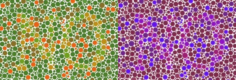
A type of PIP that are visible to the Colorblind, but not Color Normals. This is not because the Colorblind have better hue discrimination for some colors, but because they can see a small change in contrast in a field of flat colors whereas Color Normals see many different colors.
Normally, PIPs are designed where the foreground and background are different colors, but represent Colors of Confusion for a certain type of CVD. In Reverse PIPs, all of the colors used in both foreground and background are along a confusion line. In the left image below, orange yellow and green are used [Hues 20°, 40°, 80°, 100°], but tuned to the correct saturation to make sure they are on a line of confusion, and tuned to the same brightness to ensure there is no brightness gradient. Then the image/foreground is added by selectively increasing the brightness (by a small amount) of some of those dots.